
Client
Sando Lane
Brand Identity Development
Brand Guidelines
Collateral Design
Interior Direction
SCOPE
Sando Lane is an experimental Japanese katsu sandwich concept set within the creative laneways of Melbourne. The brief called for a brand identity and physical retail experience that could bridge two distinct cultural worlds — the electric energy of Tokyo's streetscape and the eclectic, artistic spirit of Melbourne's inner-city laneways — without feeling derivative of either.
The work was developed across two phases, culminating in a complete brand system and store design direction ready for launch.
OVERVIEW
THE WORK
Brand Identity
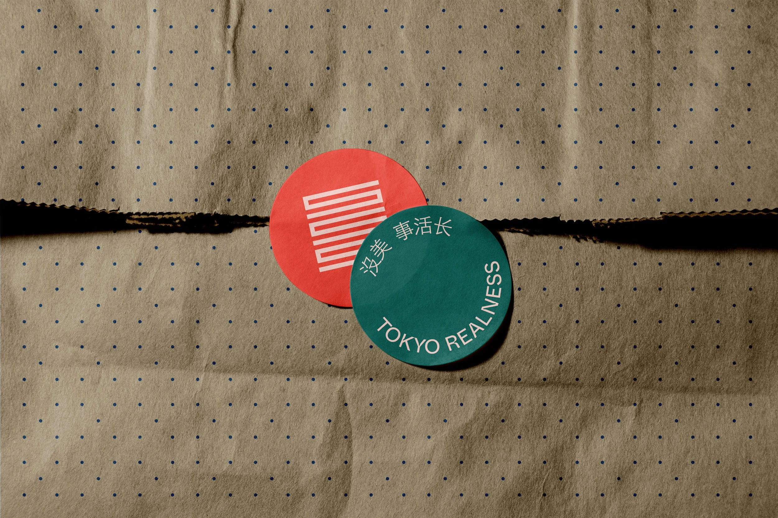
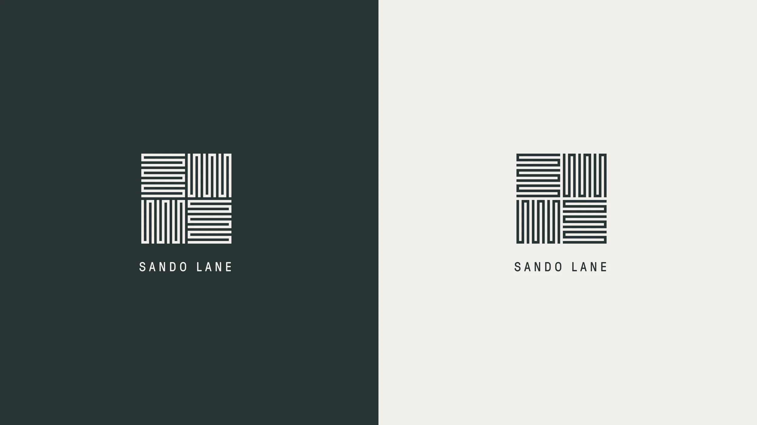
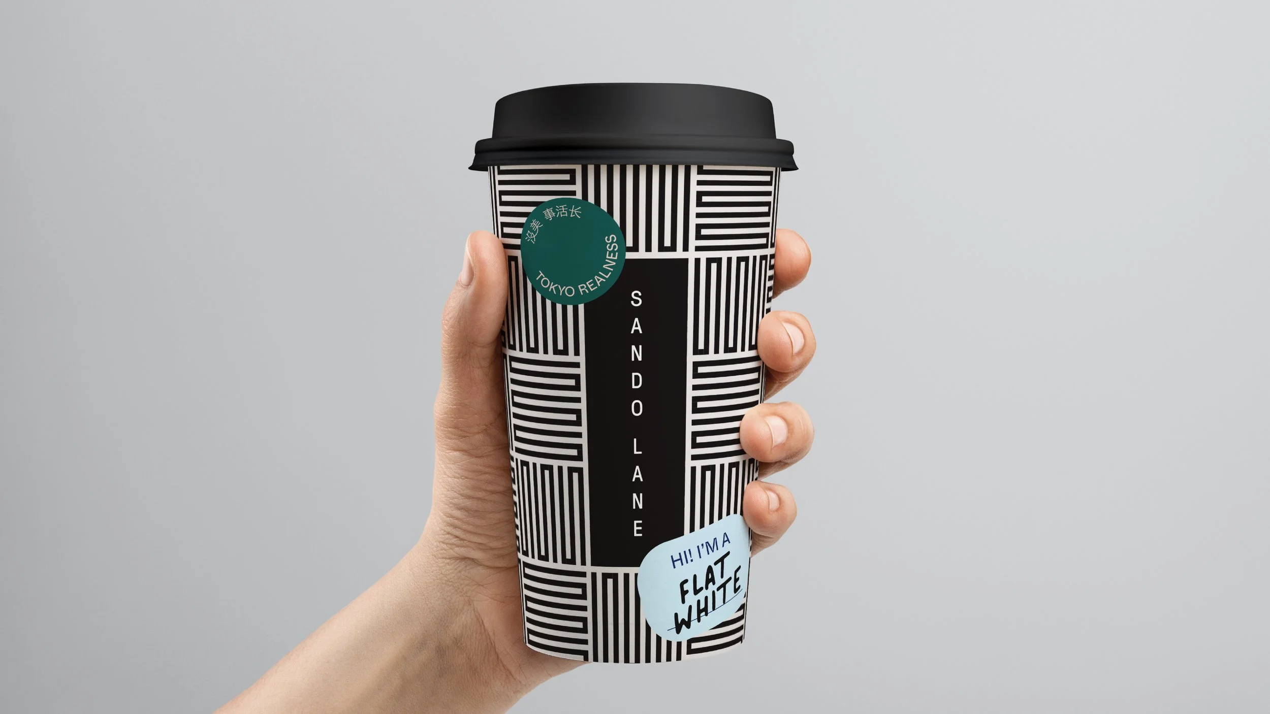
The visual identity is built around a single, confident idea: juxtaposition. A stark black-and-white palette and vertical logotype — letters stacked one per line, reminiscent of Japanese street signage — sit at the centre of the system. The brand icon, an abstracted grid of horizontal and vertical lines, doubles as a graphic pattern, a packaging motif, and a standalone mark. It is structural and restrained, yet quietly alive.
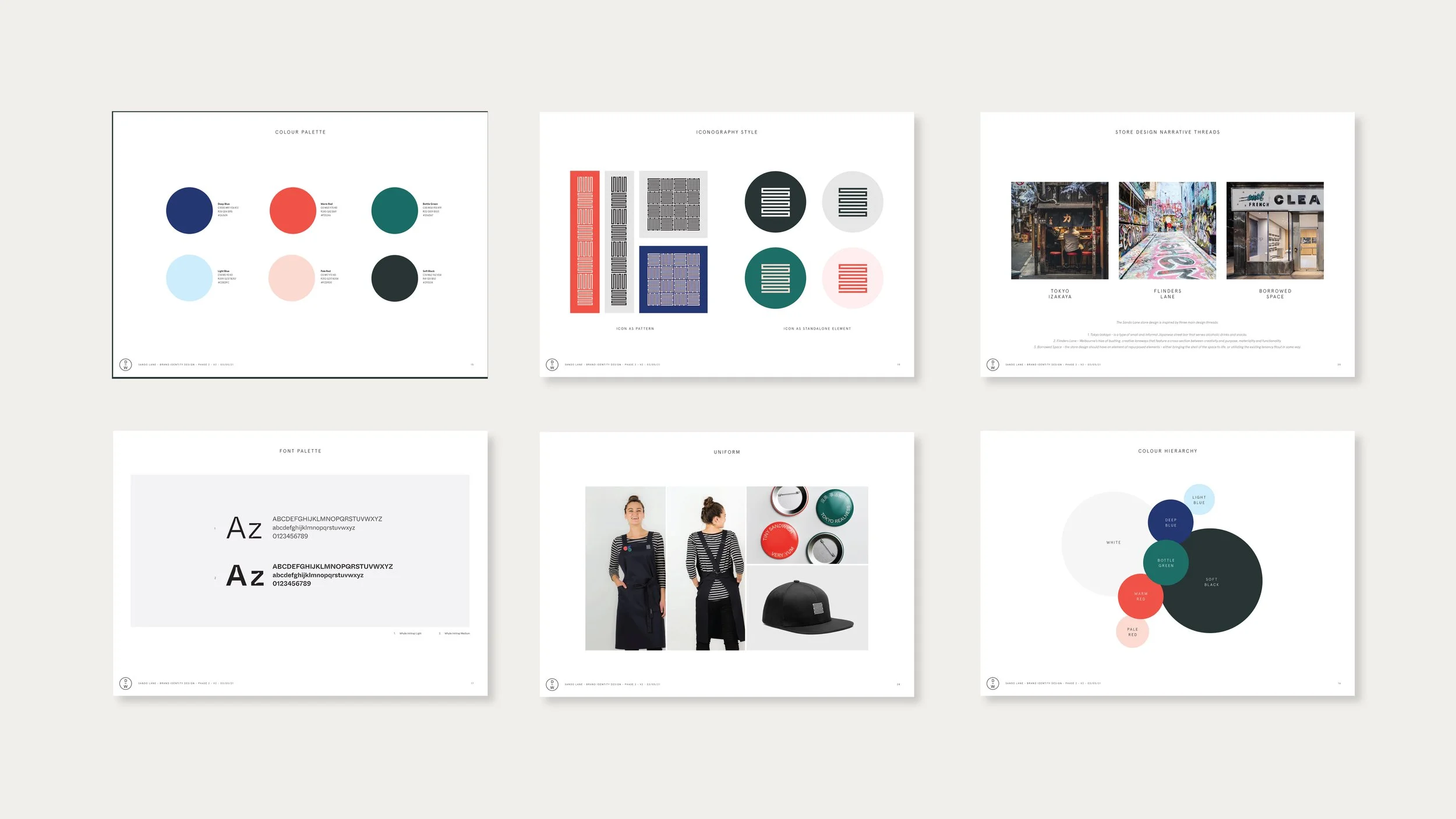
Three design threads informed the visual language: Tokyo Glow (the luminous vertical signage of Shinjuku and Shibuya), Laneways of Melbourne (urban, eclectic, full of discovery), and Japanese Graphic Design (the Wabi-Sabi principle of finding beauty in imperfection). These threads were translated into a colour palette of deep navy, warm red, bottle green, and their softer tonal pairs — bold enough for impact, considered enough for longevity.
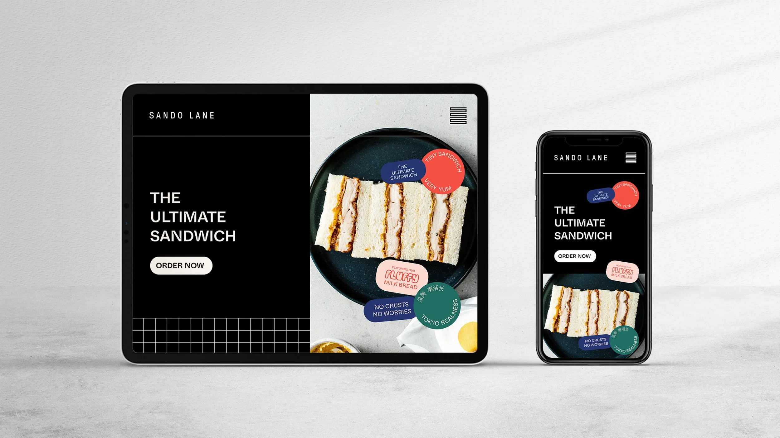
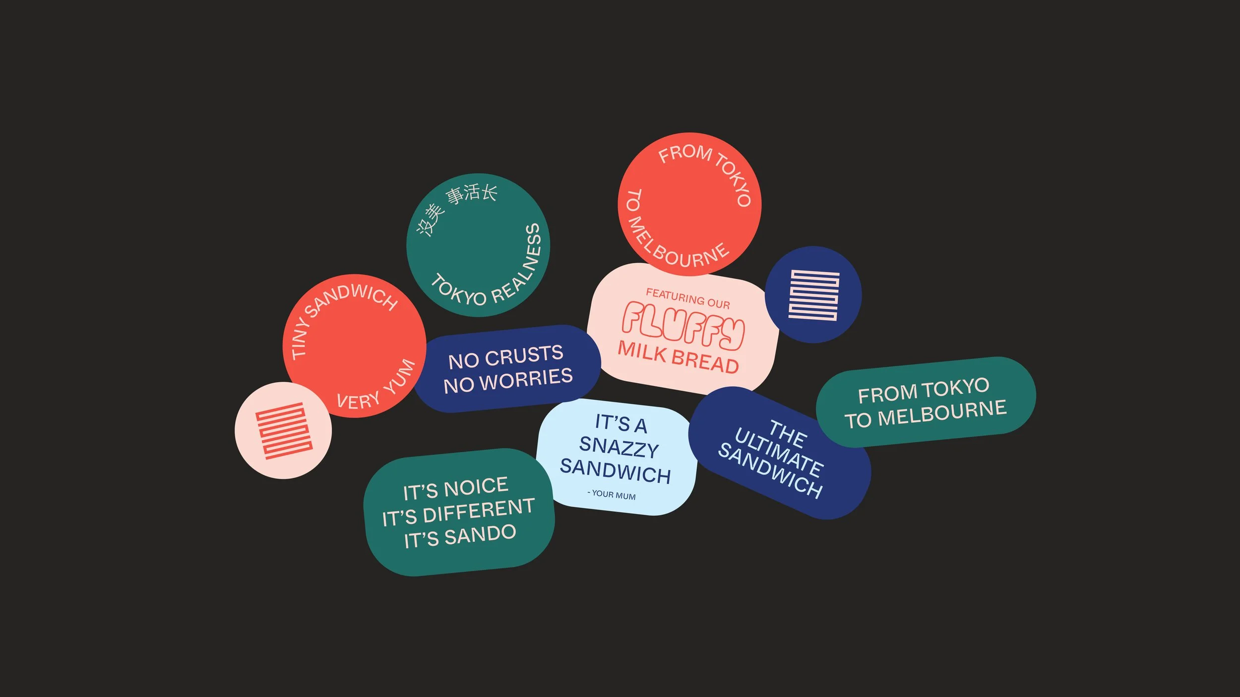
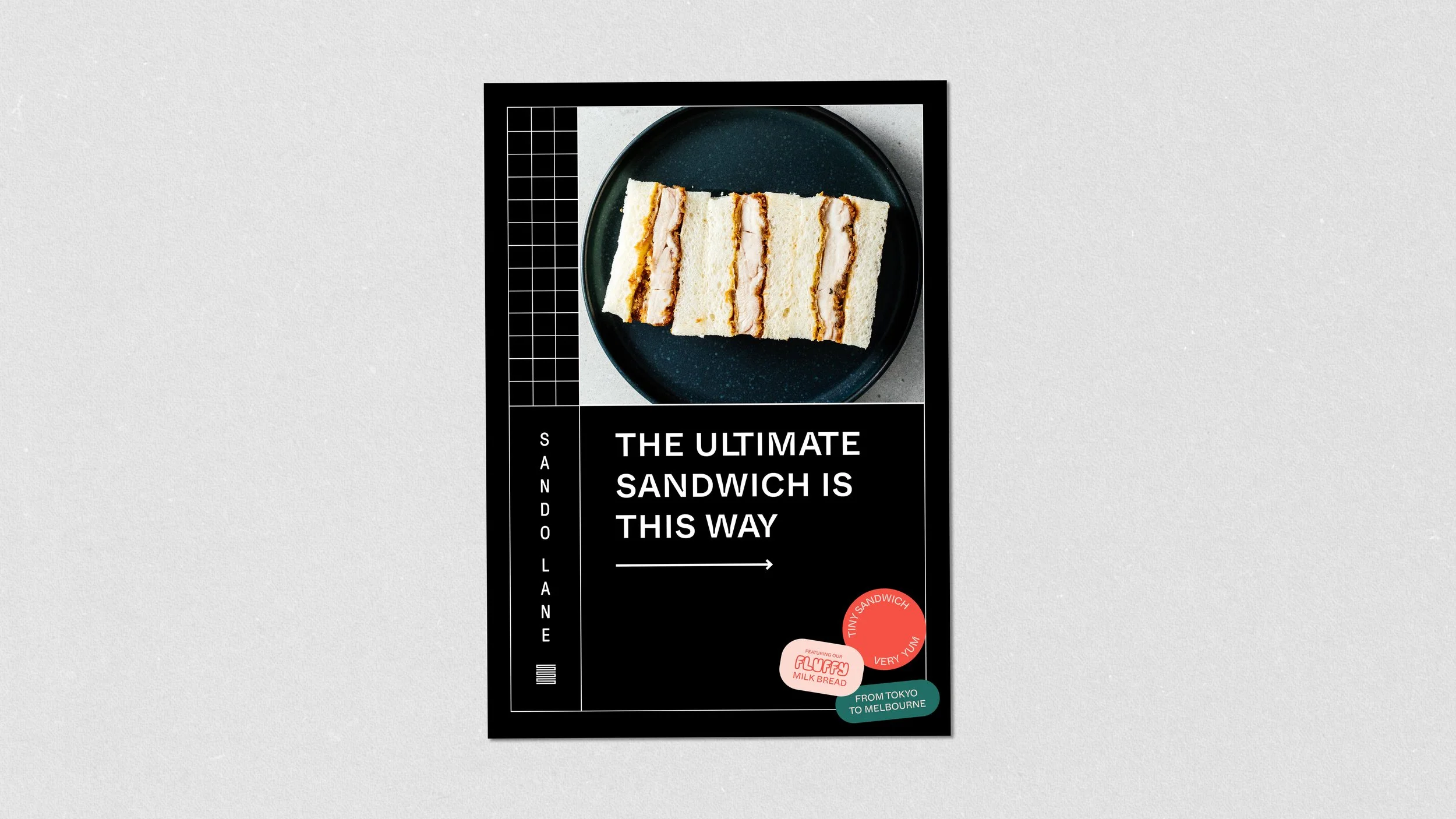
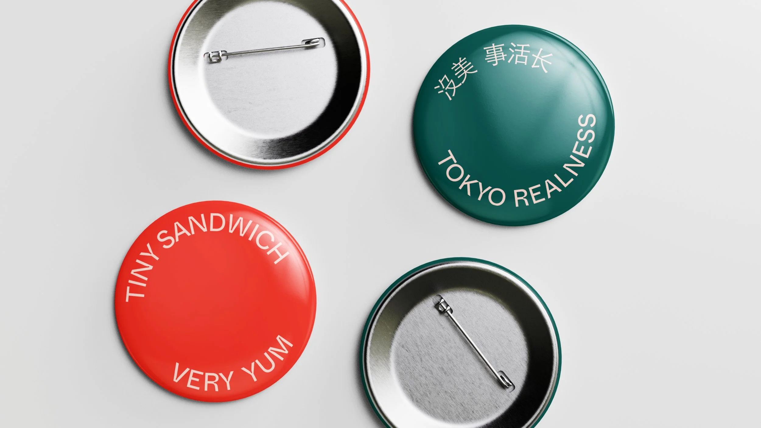
Typography is anchored by Whyte Inktrap in Light and Medium weights: geometric, sturdy, and subtly characterful. Brand voice is playful and irreverent — "No Crusts No Worries," "Very Yum," "It's Noice. It's Different. It's Sando" — delivered through circular sticker lockups and typographic posters that feel hand-applied rather than designed.
Packaging & Execution
Packaging follows a launch-first logic: kraft and matte black bags stamped with the vertical logo in black ink, stickers applied by hand in-store. The approach is deliberately imperfect — expressive, tactile, and human. Coffee cups, cutlery wrappers, napkins, and clamshell boxes extend the system consistently without over-engineering it.
Store Design
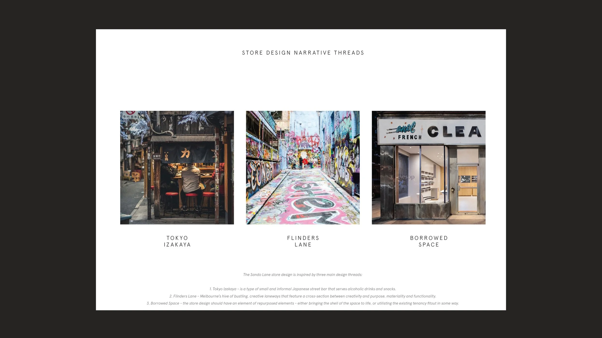
The physical retail concept draws from three parallel narratives: the intimate darkness of a Tokyo Izakaya, the gritty creativity of Flinders Lane, and the idea of Borrowed Space — honouring and repurposing whatever tenancy the brand inhabits. Inspired by Aesop's Upper West Side store (built inside a former dry cleaner), the direction asks: how do you elevate an existing shell rather than erase it?
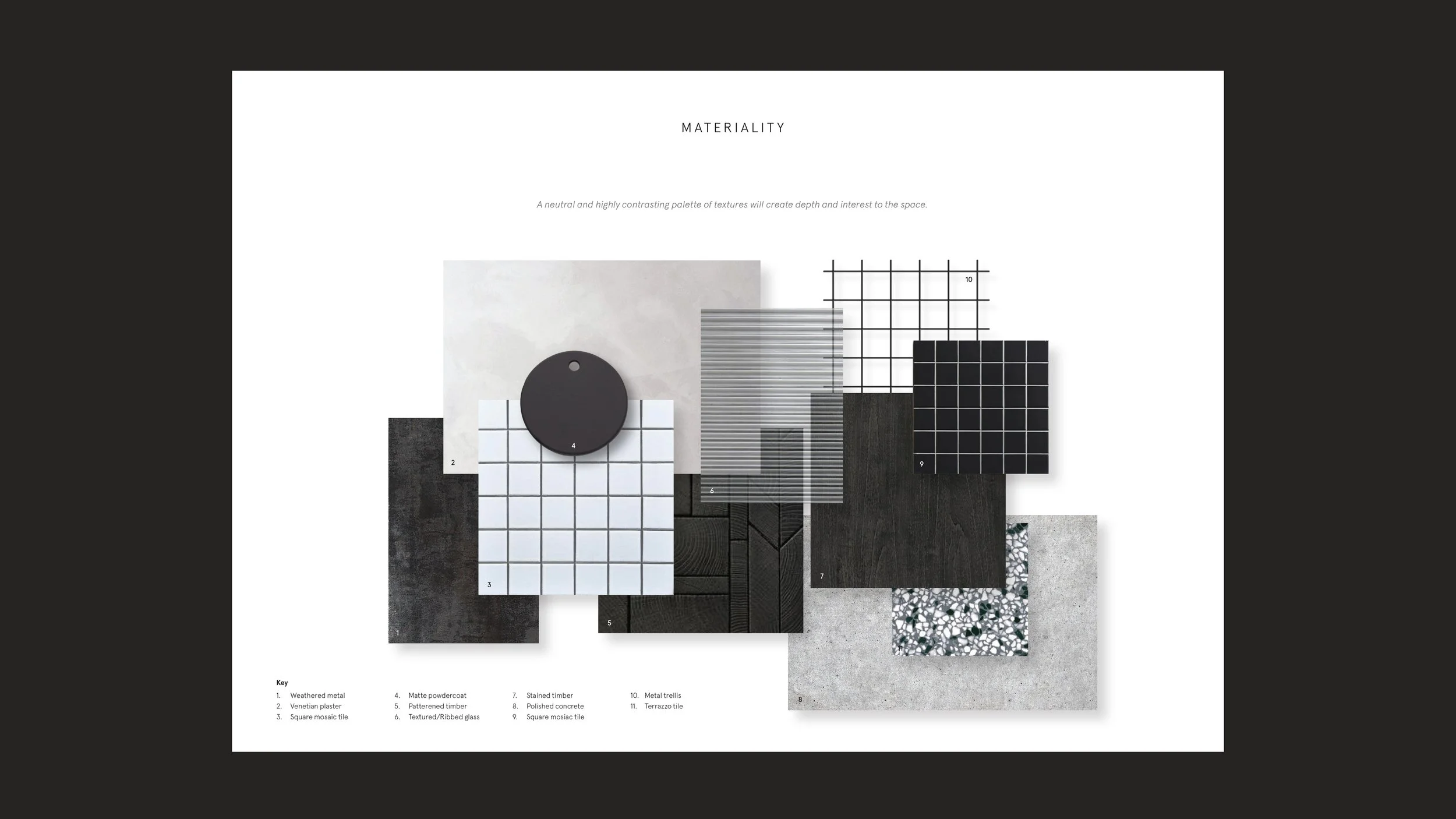
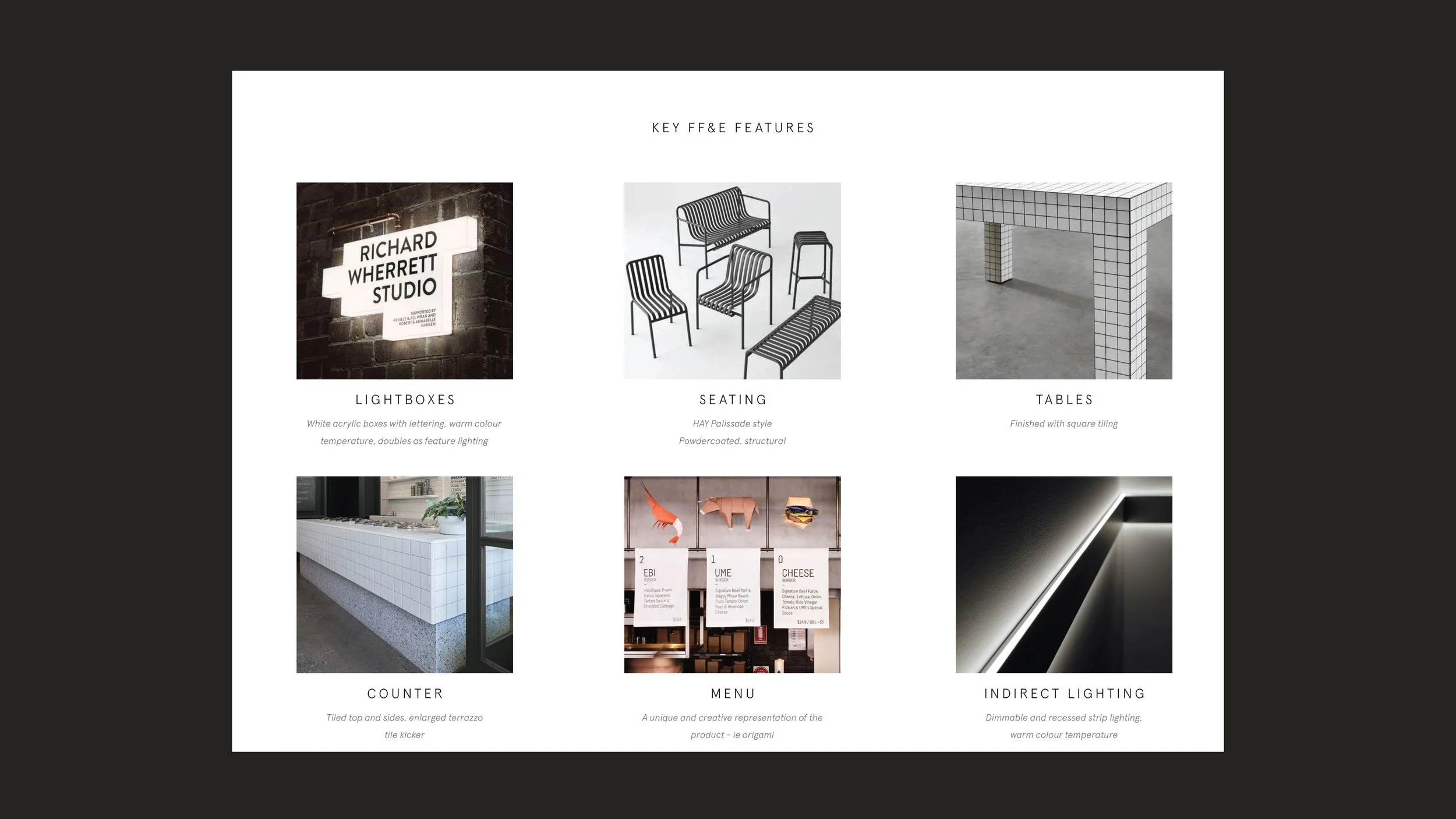
The master mood is distinctive, minimal, and juxtaposed. A dramatic wall mural — referencing artists like Rone or Ghost Patrol — anchors the interior against a deliberately restrained material palette: polished concrete, square mosaic tile, weathered metal, ribbed glass, and terrazzo. Grid structures appear in ceiling details, table surfaces, and signage, tying the physical environment back to the brand's graphic DNA.
Key FF&E features include illuminated white lightboxes displaying the vertical logo (echoing Tokyo street signage), HAY Palissade-style powdercoated seating, tiled counters with terrazzo kickers, and warm recessed strip lighting. The product is made visible on approach — via lightbox photography or looped preparation video — drawing a clear, confident path from street to counter.