

Client
Sushi Sushi Australia
Brand Identity Development
Brand Guidelines
Creative Direction
Photoshoot Art Direction
National Campaign Design
In-store Collateral
Digital Collateral
SCOPE
Sushi Sushi is one of Australia's most recognised fresh Japanese food brands, operating a network of stores across the country. As the brand evolved toward a new era of store design, it needed a cohesive creative foundation — one that could scale consistently across physical environments, digital platforms, and national campaigns.
The challenge was to take a well-loved, familiar brand and give it the depth, discipline, and visual rigour to grow — without losing what made it recognisable.
This engagement covered end-to-end brand development: from establishing foundational guidelines and a scalable identity system, through to directing the creative output that brought those principles to life across every touchpoint in the Sushi Sushi ecosystem.
OVERVIEW
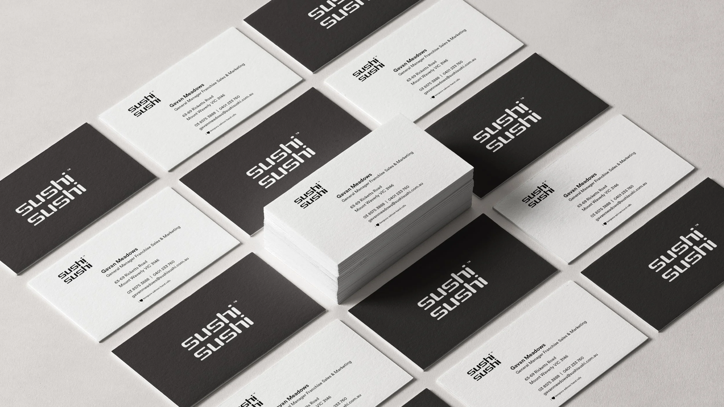
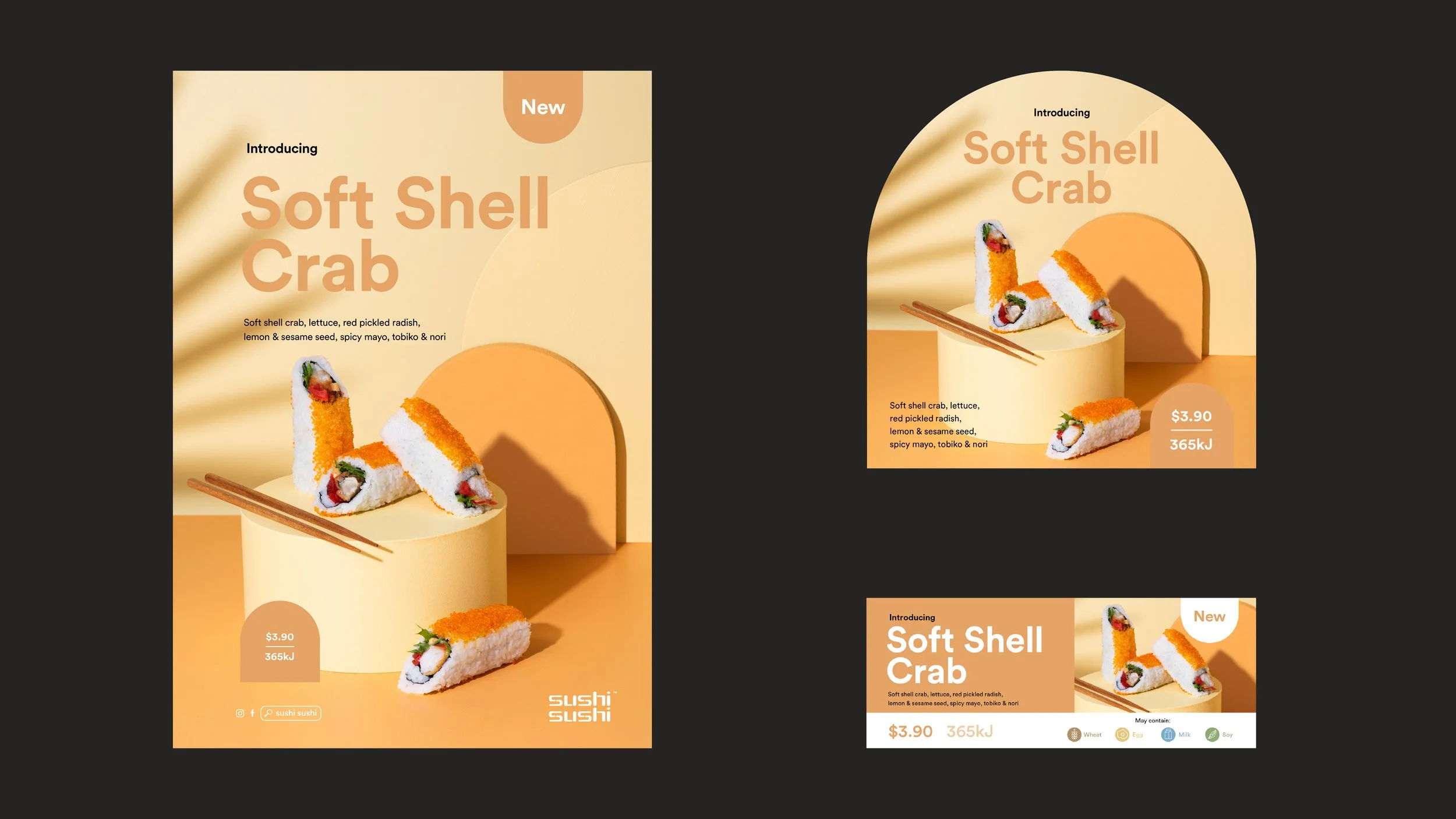
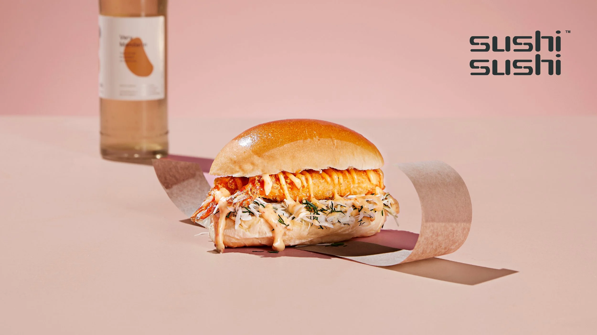
The scope spanned strategy, design, direction, and production — addressing the brand at every level from foundational principles down to individual collateral pieces.
Brand Guidelines
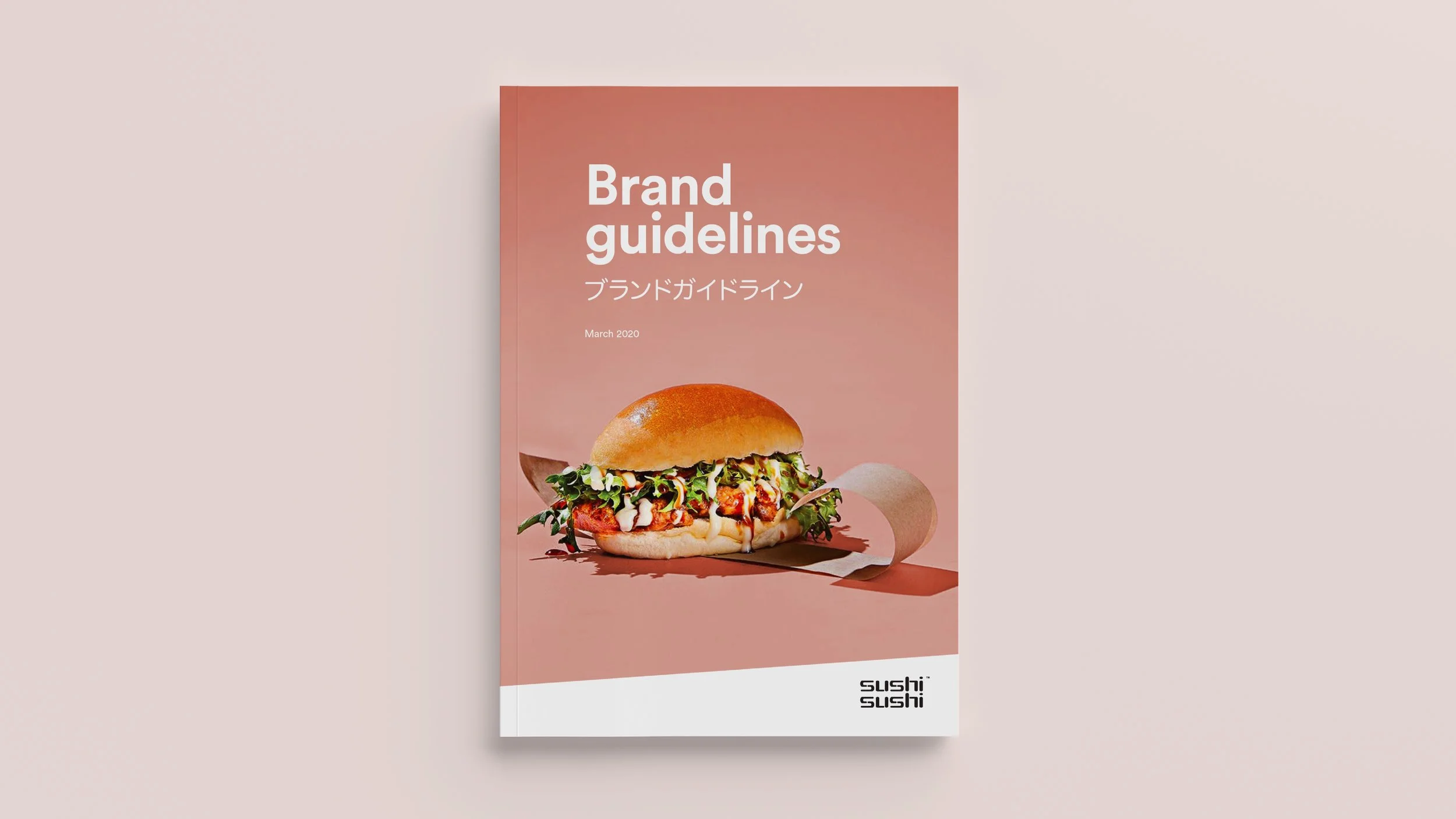
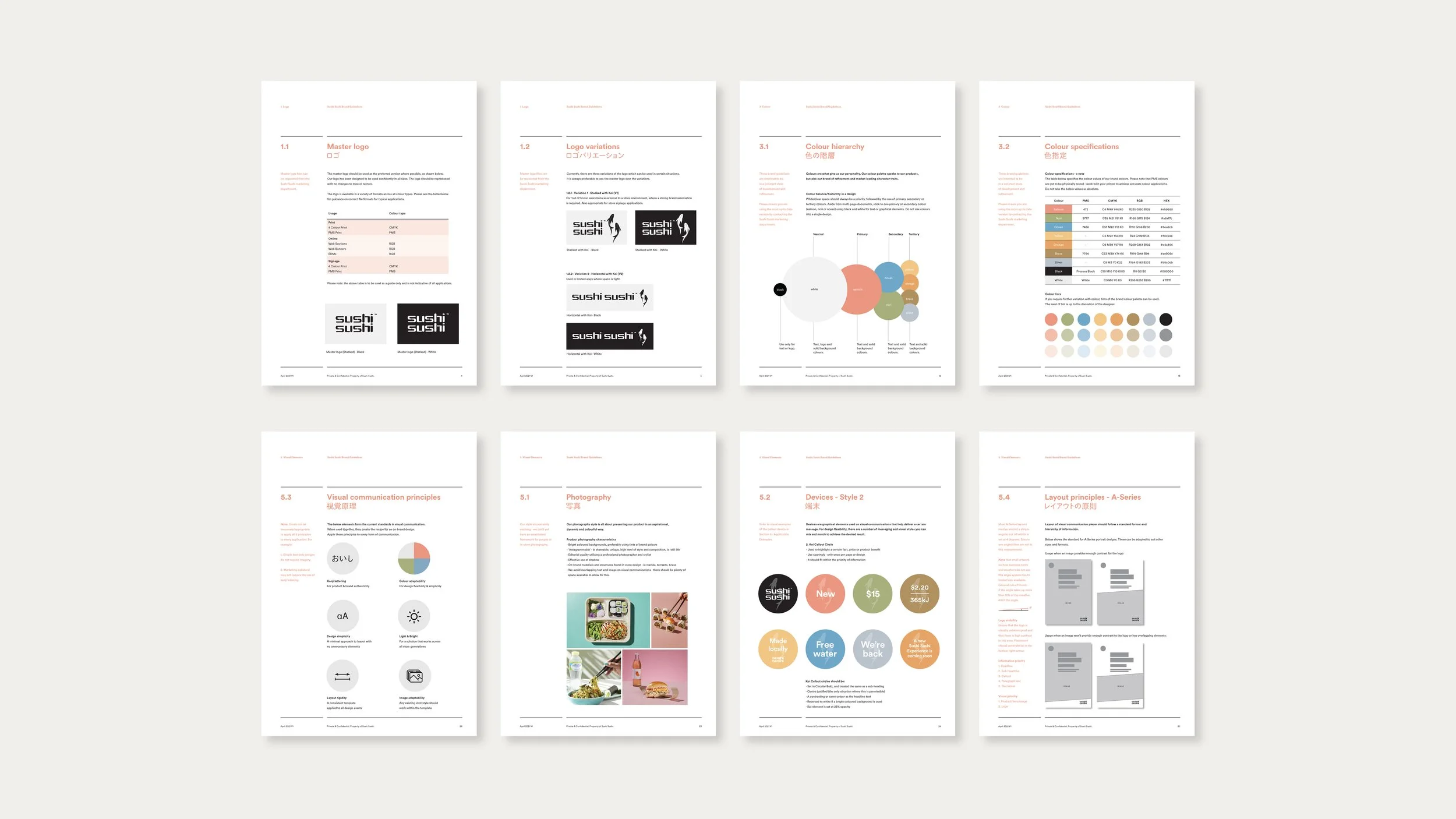
Developed comprehensive brand guidelines that codified the Sushi Sushi identity — covering typography, colour, tone, photography, and usage principles for use across the store network.
Photoshoot Direction
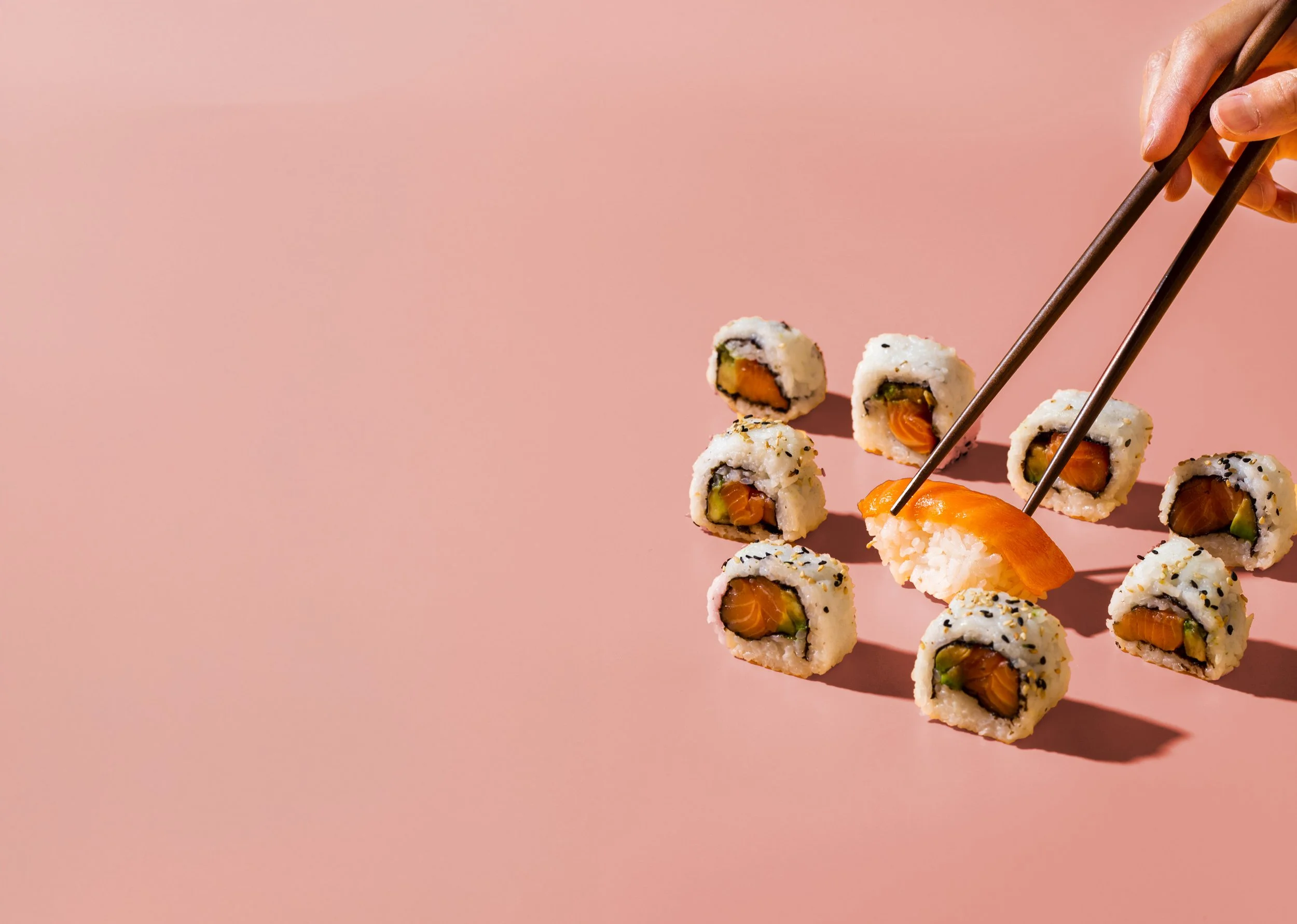
Art directed photoshoots to build the brand's visual library — establishing a cohesive photographic style for food, environment, and campaign imagery used across all brand expressions.
National Campaign Design
Led the design of national campaigns — bringing together visual language, photography, and messaging across media formats to connect with customers consistently at a national scale.
In-store & Digital Collateral
Designed the full suite of in-store and digital collateral — menus, POS material, digital signage, promotional assets — maintaining consistency and brand quality across every customer-facing format.
THE WORK
Central to the engagement was building a brand design system robust enough to operate across a national network — giving internal teams, franchisees, and production partners a shared visual language.
Visual Language
Defined core typographic and colour principles that held the brand together across print, digital, and environmental applications.
Photography Direction
Established a distinct photographic aesthetic — lighting, composition, and styling — giving the brand a consistent visual tone that could be reproduced across shoots.
Scalable Templates
Created production-ready templates and asset systems so the brand could expand to new stores and campaigns without losing coherence or quality.
BRAND DESIGN SYSTEM
Image Credits
- Sushi Sushi Australia